Aspect Rati-woes
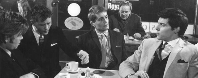
In his review column today, DVD Savant Glenn Erickson, in the course of writing about an interesting East German thriller from the ’60s, mentions that the disk has been mastered at a ratio of 1.85:1 although the film was shot and released at 2.25:1. In other words, despite the fact that it’s been released by the DEFA Film Library at the University of Massachusetts, Amherst – that is, by an organization dedicated to restoring and distributing the work of the East German film industry from the communist era – someone there made a decision to reformat the image to fit a standard HD television screen.
The issue of aspect ratios has plagued home video since the invention of VHS and Betamax back in the ’70s. With TV back then trapped in the almost-square 1.33:1 frame (or 4:3), all home video was initially pan-and-scanned – that is, when the transfers were made, an operator had to choose what parts of a widescreen frame would be committed to tape. Huge areas of the image were lost from any movie which had been shot in any ratio wider than the original Academy standard (either 1.33:1 or 1:37:1, depending on who you believe) – and the wider the original, the worse the cropping.
Gradually, during the ’80s, distributors began to recognize the desire of at least part of their audience to see the whole frame, and some tapes were released letterboxed – the full width of the image was accommodated by adding black bars to the top and bottom of the screen. Those of us who cared were very grateful. But for those who didn’t care, the bars were an annoyance. (I can recall browsing in a store one day when a guy noted a letterboxed tape and complained to his girlfriend that this was crap because it “wasted” half the TV screen.)
Letterboxing gradually became more common, and in the early days of DVD it wasn’t unusual to see disks which offered both a widescreen and a pan-and-scanned copy of a movie, satisfying both sides of the argument. Then HD televisions entered the market and people became increasingly accustomed to the wide screen. But those TVs had been standardized at 16:9 (1:85.1 or 1.78:1, depending), an intermediary ratio between the Academy screen and the traditional 2.25:1 theatrical widescreen frame. Given that over the years there have actually been many different ratios – Cinemscope is approximately 2.25:1; Britain for quite a while used a stubbier 1.66:1; Ben-Hur’s 70mm image was an eye-popping 2.76:1 – this seemed like a reasonable compromise.
But of course, it didn’t eliminate black bars: for anything at a lower ratio (1.33:1, 1.66:1), these bars would be on the side. For wider frames, they would still appear at top and bottom. For people who still somehow believed that areas of their screen were being “wasted”, the hideous possibility of stretching or squeezing the image to fill the screen was offered as a standard feature on all HD TVs (I know I shouldn’t get upset, but it drives me nuts when I see people watching movies with stretched or squeezed images; they don’t look in the least natural, but somehow the people who watch this way don’t seem bothered by seeing all those grossly distorted people on TV).
For the rest of us, who just want to see the movie framed as it was originally intended, the arrival of widescreen TVs and the common practice of letterboxing seemed like a perfectly acceptable solution. But, as Glenn Erickson has pointed out today, some manufacturers still believe that what’s important is to fill the screen, not respect the art.
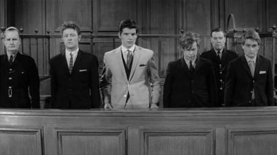
This struck a nerve with me because I’ve seen two disks in the past few days which have been improperly formatted (both region 2 releases from England). Renown Pictures’ release of Sidney J. Furie’s The Boys (1962) has been cropped from 2.25:1 to fill the 16:9 TV screen. Although producing a constant sense of mild irritation, I was glad to see the film, particularly as it was taken from a very good print source. But Furie had obviously put a great deal of effort into the visual composition of this courtroom drama, framing the characters so that connections and relationships were maintained at all times – connections which were disrupted by Renown’s reframing which inevitably removed characters from one side of the frame or the other, occasionally compounded by those annoying little artificial pans to catch the missing character when he or she starts to speak. As was often the case in the old 4:3 days, the film’s opening titles were transferred properly letterboxed, making the sudden shift to the cropped frame even more frustrating.
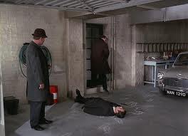
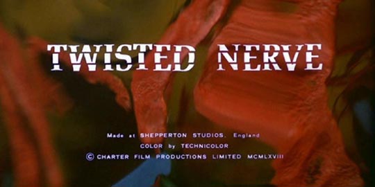
The other disk, from Optimum/Studio Canal (who really should know better) was the Boulting Brothers’ psychological thriller Twisted Nerve (1968), interesting for several reasons, not least for being Hayley Mills’ first “adult” role (as an attractive student who draws the attention of a psychotic young man), making that often so-awkward transition from child star to grown up. It also has a script co-written by Leo Marks, who wrote Peeping Tom (1960) for Michael Powell. Although not on the same level, Twisted Nerve does generate a queasily uncomfortable atmosphere with its treatment of mental illness and violence.
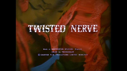
When the disk arrived, I was disappointed to see the aspect ratio listed as 1.33:1 on the case. Of course, by 1968, no one was releasing films in that ratio, so I gritted my teeth and sat down with the expectation of finding Roy Boulting’s movie all but unwatchable. But it quickly became apparent during the opening titles that the print hadn’t been pan-and-scanned, but rather transferred open-matte. There are two main ways to produce a widescreen image: using anamorphic lenses which compress the picture information horizontally, requiring comparable lenses in projection to unsqueeze the picture; and shooting a flat 35mm image which is later cropped in projection to give the appearance of a wider frame. An open matte transfer copies the full 35mm frame to video, producing an Academy ratio image which includes all the dead space at top and bottom which should be matted out.
The advantage of this method is that it’s possible to zoom the image in on a widescreen TV to approximate the proper framing; the disadvantage is that blowing the image up this way produces a softer, grainier picture. Still, even that is preferable to pan-and-scanning with consequent picture loss.
All of which is just a very long-winded way of getting around to asking why it is that people who work in this business, who should have a decent working knowledge of these issues, continue to make these bone-headed decisions to compromise the product they’re expecting us movie consumers to buy?
Comments
“Of course, by 1968, no one was releasing films in that ratio.” Incorrect, there are many examples. E.g. The Shining (1980).
Admittedly, my comment is rather sweeping, but one example doesn’t amount to “many examples” … there were occasional releases using this ratio for aesthetic reasons, but even Kubrick (who preferred 1.33:1 for all his later releases) shot so that these films could be projected at 1.66:1 without causing damage to the image.